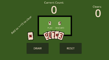
DJ 05 Card Player
Add up to 15 or greater to clear. Click the box to play, click outside the box to deselect.
Retro:
Wow. I think it took 4 or 5 days? I could feel myself being sick of it, and just wanting it to be done as it went on. I was getting impatient, just clicking and not really thinking about what I was doing, just trying to get it done.
Definitely some really good things learned. It's hard to think of everything, especially from early on. It'll probably be good to do a journal entry every day I work. Which, considering I want to work as if it were a full time job, might be a bit much -_-'. Still! The point of this work is to learn, and reflecting is when things sink in better, I think. If I'm going to do this, I might as well do it right, right?
SIL (Shit I learned)
Uhhh, let's see. I made a card program. You can click and play cards. I used resources a lot? I guess I can bullet some of this out.
- Love me my Resources.
- Super useful.
- Really a way to help with organization, for me at this stage. Maybe they help a lot with optimization, but I'm not at a point where I need that.
- Was able to access the data easily.
- Methods don't run on them. In order to update data in them, put a function in the setter that updates/sorts/calculates how I want it to. Remember to property_list_changed.emit() so the inspector will update
- Use more scripts
- I think I was afraid to use scripts. Or, like, I was trying to keep the number of scripts down so much that it was a detriment. I was afraid of managing all the scripts but I think that could have been saved with better project management/organization. I ended up putting the animation for cards in the same script that handled the playing cards logic, and then the script was just as unwieldly as I was trying to avoid! It would have been easier to think about (maybe) if the scripts had been smaller, and I was just able to navigate to where I needed to go, through the explorer.
- Something that happened just at the end. My animations were real subtle, and they couldn't actually be seen on the small resolution. Something to keep in mind.
- On that note, animations are kind of easy (if not a bit tedious). I think I need to learn the tools a little better, but once I do, I should be able to, like, slap things together kind of quick. Same thing for particle system. There are a lot of settings, but once I know them, I think it'll be easy
enoughto navigate- Use Bezeir Curves for fun smoothing. Just takes a little fiddling, but you can pull the arms out sideways
- While animations are kind of easy (&tedious), the AnimationPlayer is not the solution I want it to be (yet?). It can only manipulate real values, not relative ones, so I had to find a workaround. I had the AnimationPlayer manipulate a field, stored my relative rotation separately, and then combined the two in _process()
- On that note, animations are kind of easy (if not a bit tedious). I think I need to learn the tools a little better, but once I do, I should be able to, like, slap things together kind of quick. Same thing for particle system. There are a lot of settings, but once I know them, I think it'll be easy
- I'll know when to use AutoLoads. Don't use them when I don't have to. I tried to put one in where it didn't belong, and it just made everything harder.
- Get better at figuring out who should do what. I had the hand object doing way too much. It was arranging the cards, sorting them, deciding if things should be played or not. It felt bad the whole time. I did work, but I don't think I could have added the feature where cards were moving across the screen, that you could click.
- Same thing for the cards animation. Since they animated themselves, they were stuck always being animated. I couldn't do other things with them.
- UI controls are kind of easy. A lot of settings, but easy to navigate once known.
- Addons, I think, are valuable, but a lot to handle. Maybe I should stay away, for now?
- And then, I know it's not engine development, but I'm pretty proud of my sprites! I don't remember if I used someone else's palette, but I think my numbers looked good! I that as long as you pick a theme/pattern/whatever and stick with it, it'll look good! Not with, like everything, but I guess my point is that consistency is almost more important than what the idea itself actually is.
- It's fun connecting things with just signals :D Like pulling out a button, and connecting it to code that already exists. Love it.
Post post retro!
- After uploading it and looking at it, I went back and added some color to the background and fonts and such, and I think the return on investment is really high. It took so little work, and it looks a lot less hacked together. Put in the little effort to clean up the edges. Take a few minutes to make it a cohesive color palette.
| Status | Released |
| Platforms | HTML5 |
| Author | Cononymous |
| Made with | Godot |

Leave a comment
Log in with itch.io to leave a comment.